Note
Go to the end to download the full example code.
Plot customizations
This example shows how to include some advanced options in the visualization of catalogs, forecasts and evaluation results
- Overview:
Define optional plotting arguments
Set the extent of maps
Visualizing selected magnitude bins
Plot global maps
Creating composite plots
Plot multiple Evaluation Results
Please refer to the Plotting API Reference for a description of all PyCSEP plotting functionality.
Example 1: Customizing Gridded Dataset Plot
Load required libraries
import csep
import cartopy
import numpy
from csep.utils import datasets
from csep import plots
Load a Grid Forecast from the datasets
We use one of the gridded forecasts provided in the datasets
forecast = csep.load_gridded_forecast(datasets.hires_ssm_italy_fname,
                                      name='Werner, et al (2010) Italy')
Plotting the dataset with fine-tuned arguments
These arguments are, in order:
Set the figure size
Set the spatial extent of the plot
Access ESRI Imagery as a basemap.
Assign a title
Set labels to the geographic axes
Draw country borders
Set a linewidth of 1.5 to country border
Assign
'rainbow'as the colormap. Possible values frommatplotlib.cmlibraryDefines 0.8 for an exponential transparency function (default is 0 for constant alpha, whereas 1 for linear).
An object
cartopy.crs.Projection(in this casecartopy.crs.Mercator) is passed to the map
The complete description of plot arguments can be found in csep.plots.plot_gridded_dataset()
ax = forecast.plot(figsize=(10, 8),
                   extent=[3, 22, 35, 48],
                   basemap='ESRI_imagery',
                   title='Italy 10 year forecast',
                   grid_labels=True,
                   borders=True,
                   borders_linewidth=1.5,
                   cmap='rainbow',
                   alpha_exp=0.8,
                   projection=cartopy.crs.Mercator(),
                   show=True)
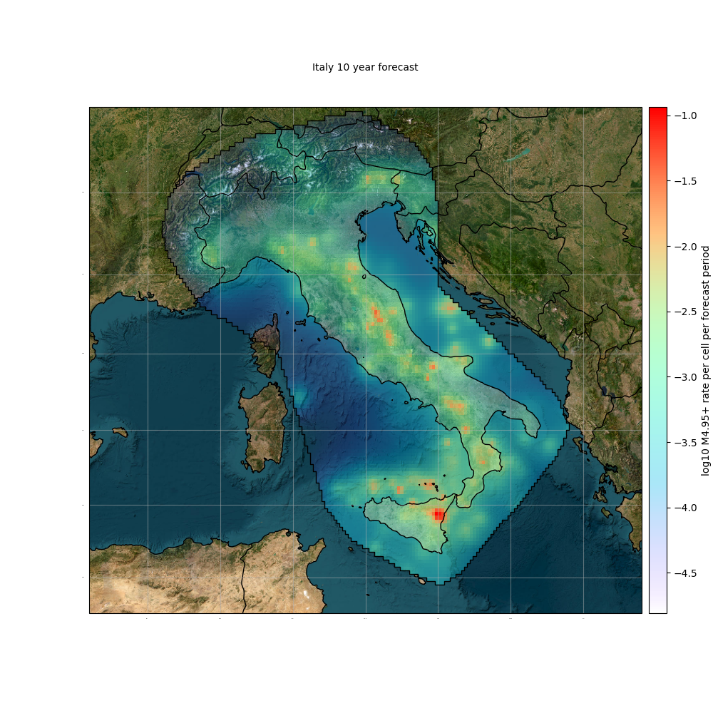
Cleaning existing basemap cache
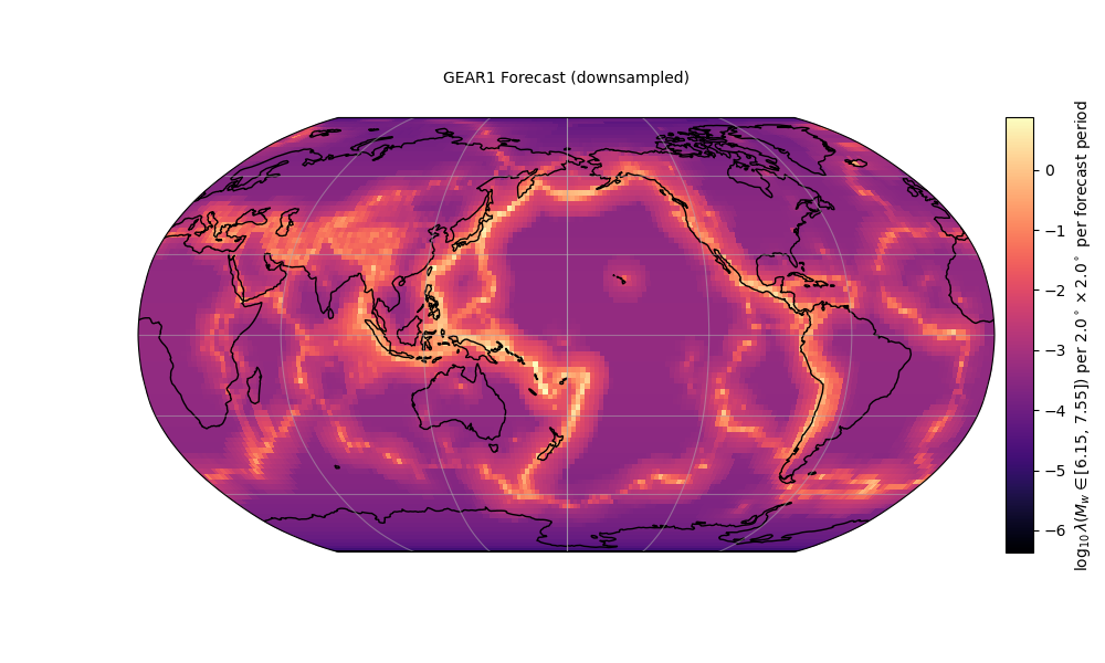
Example 2: Plot a global forecast and a selected magnitude bin range
Load a Global Forecast from the datasets
A downsampled version of the GEAR1 forecast can be found in datasets.
forecast = csep.load_gridded_forecast(datasets.gear1_downsampled_fname,
                                      name='GEAR1 Forecast (downsampled)')
Filter by magnitudes
We get the rate of events of 6.15<=M_w<=7.55
low_bound = 6.15
upper_bound = 7.55
mw_bins = forecast.get_magnitudes()
mw_ind = numpy.where(numpy.logical_and(mw_bins >= low_bound, mw_bins <= upper_bound))[0]
rates_mw = forecast.data[:, mw_ind]
We get the total rate between these magnitudes
The data is stored in a 1D array, so it should be projected into the region 2D cartesian grid.
Plotting the dataset
To plot a global forecast, we must assign the option set_global=True, which is required by cartopy to handle
internally the extent of the plot. We can further customize the plot using the required arguments from plot_gridded_dataset()
ax = plots.plot_gridded_dataset(
            # Required arguments
            rate_sum_log,
            forecast.region,
            # Optional keyword arguments
            figsize=(10, 6),
            set_global=True,
            coastline_color='black',
            projection=cartopy.crs.Robinson(central_longitude=180.0),
            title=forecast.name,
            grid_labels=False,
            colormap='magma',
            clabel=r'$\log_{10}\lambda\left(M_w \in [{%.2f},\,{%.2f}]\right)$ per ' \
                   r'${%.1f}^\circ\times {%.1f}^\circ $ per forecast period' % \
                   (low_bound, upper_bound, forecast.region.dh,
                    forecast.region.dh),
            show=True)
Example 3: Plot a catalog with a custom basemap
Load a Catalog from ComCat
start_time = csep.utils.time_utils.strptime_to_utc_datetime('2002-01-01 00:00:00.0')
end_time = csep.utils.time_utils.strptime_to_utc_datetime('2012-01-01 00:00:00.0')
min_mag = 4.5
catalog = csep.query_comcat(start_time, end_time, min_magnitude=min_mag, verbose=False)
Fetched ComCat catalog in 12.818142414093018 seconds.
Define plotting arguments
These arguments are, in order:
Assign a TIFF file as basemap. The TIFF must have the same coordinate reference as the plot.
Set minimum and maximum marker size of 7 and 500, respectively.
Set the marker color red
Set a 0.3 transparency
power is used to exponentially scale the size with respect to magnitude. Recommended 1-8
Set legend True and location in 3 (lower-left corner)
Set a list of magnitude ticks to display in the legend
The complete description of plot arguments can be found in csep.plots.plot_catalog().
In case we want to store the arguments (i.e., for future plots) we can store them as a dictionary and then unpack them into the function with **.
plot_args = {'basemap': csep.datasets.basemap_california,
             'size': 7,
             'max_size': 500,
             'markercolor': 'red',
             'alpha': 0.3,
             'power': 4,
             'legend': True,
             'legend_loc': 3,
             'coastline': False,
             'mag_ticks': [4.0, 5.0, 6.0, 7.0]}
Plot the catalog
ax = catalog.plot(show=True, **plot_args)
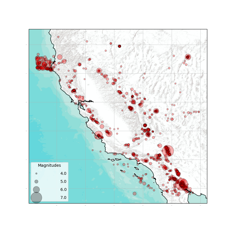
Alternatively, it can be plotted using the csep.plots.plot_catalog() function
plots.plot_catalog(catalog=catalog, show=True, **plot_args)
<GeoAxes: >
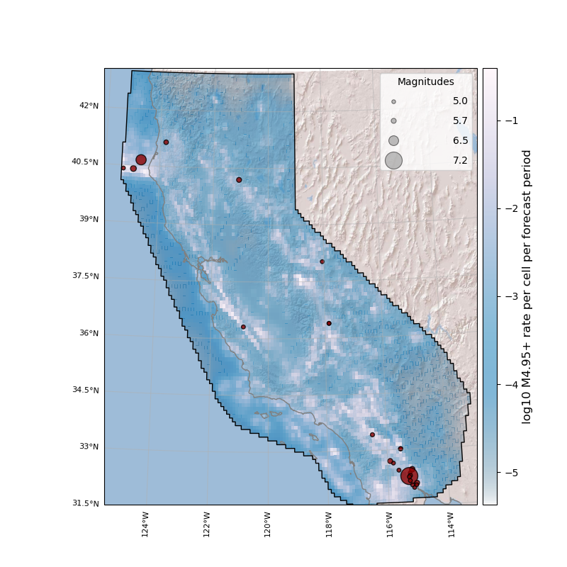
Example 4: Plot composition
Multiple spatial plots can be chained to form a plot composite. For instance, plotting a custom basemap, a gridded forecast and a catalog can be done by simply chaining the plotting functions.
Load a forecast from the datasets
Load a catalog from ComCat
start_time = csep.utils.time_utils.strptime_to_utc_datetime('2009-01-01 00:00:00.0')
end_time = csep.utils.time_utils.strptime_to_utc_datetime('2014-01-01 00:00:00.0')
min_mag = 4.95
catalog = csep.query_comcat(start_time, end_time, min_magnitude=min_mag, verbose=False)
Fetched ComCat catalog in 11.60778546333313 seconds.
Initialize a basemap with desired arguments
Plot the basemap alone by using csep.plots.plot_basemap(). Do not set show=True and store the returned ax object to
start the composite plot
# Start the base plot
ax = plots.plot_basemap(figsize=(8, 8),
                        projection=cartopy.crs.AlbersEqualArea(central_longitude=-120.),
                        extent=forecast.region.get_bbox(),
                        basemap='ESRI_relief',
                        coastline_color='gray',
                        coastline_linewidth=1
                        )

# Pass the ax object into a consecutive plot
ax = forecast.plot(colormap='PuBu_r', alpha_exp=0.5, ax=ax)

# Use show=True to finalize the composite.
plots.plot_catalog(catalog=catalog, markercolor='darkred', ax=ax, show=True)
Cleaning existing basemap cache

<GeoAxes: >
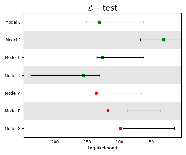
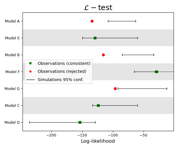
Example 5: Plot multiple evaluation results
Load L-test results from example .json files (See Grid-based Forecast Evaluation for information on calculating and storing evaluation results)
L_results = [csep.load_evaluation_result(i) for i in datasets.l_test_examples]
plot_args = {'figsize': (6, 5),
             'title': r'$\mathcal{L}-\mathrm{test}$',
             'title_fontsize': 18,
             'xlabel': 'Log-likelihood',
             'xticks_fontsize': 9,
             'ylabel_fontsize': 9,
             'linewidth': 0.8,
             'capsize': 3,
             'hbars': True,
             'tight_layout': True}
Description of plot arguments can be found in plot_consistency_test().
We set one_sided_lower=True as usual for an L-test, where the model is rejected if the observed
is located within the lower tail of the simulated distribution.
ax = plots.plot_consistency_test(L_results,
                                 one_sided_lower=True,
                                 show=True,
                                 **plot_args)  # < Unpack arguments
Total running time of the script: (0 minutes 56.186 seconds)